Case Study
Loyalty Program Simulator
How a simulator took program comprehension from 29% to 93%, and why the business almost didn’t ship it.
- Industry
- Finance
- Role
- UX Lead
- Timeline
- Since 2024
- Scope
- Mobile · Desktop
- Impact
- +2 Million users
- Program comprehension
- 29%to93%
- Research participants
- 35
- Simulated at least one time
- 86%
- Program users engaged
- 1 in 3
Short on time?30 sec summary
The problem. The bank was about to launch a loyalty program users couldn’t follow. In testing, only 29% connected their financial products to the points they generated: to know if they’d reach the next level they had to do the math by hand, against a table buried in the help section.
The approach. Two rounds of research with 35 participants, remote and analyzed with AI. The first round measured the program without the simulator. That number is what kept the simulator in the release.
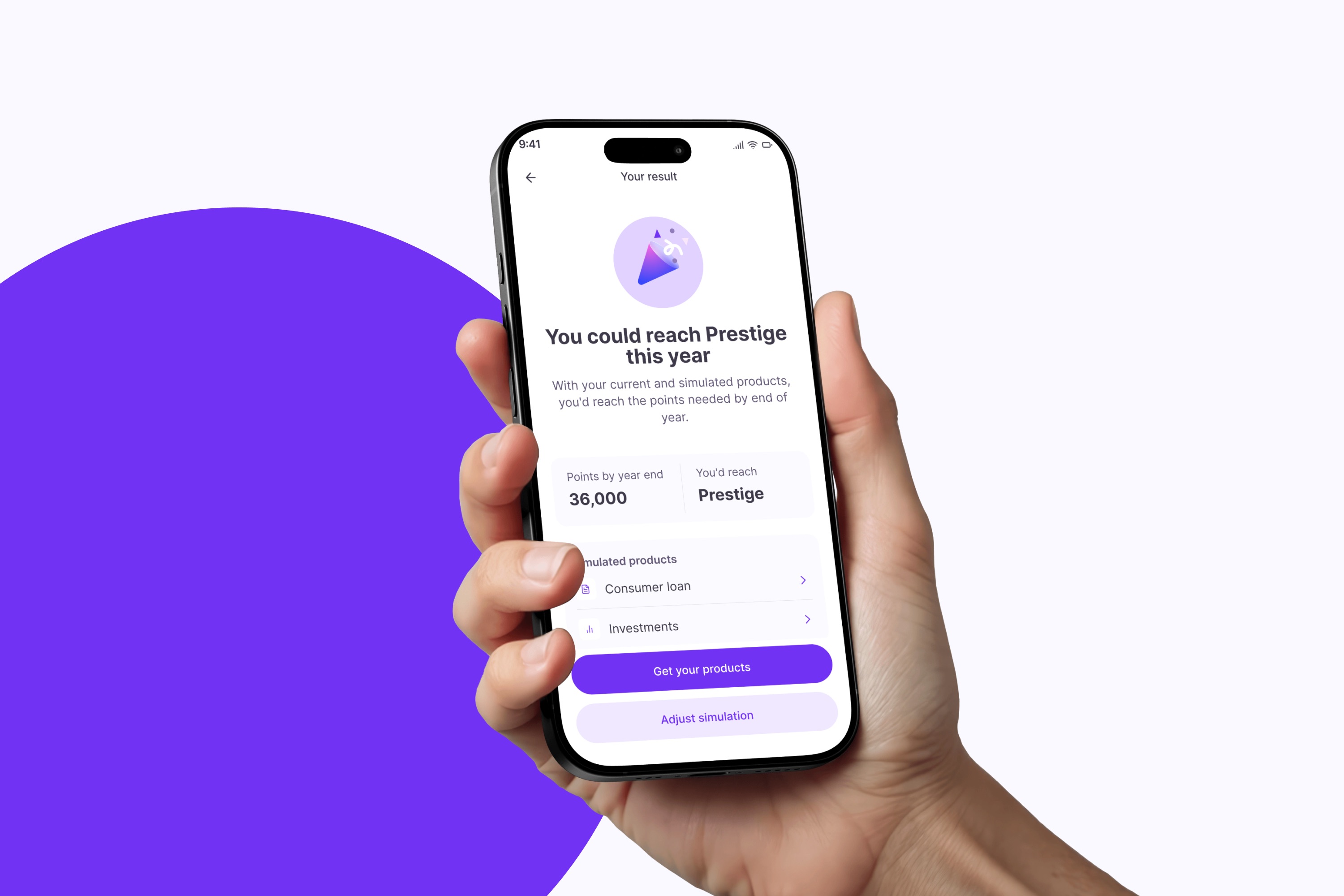
What I built. A simulator that handles the rules of six products (credit card, mortgage, consumer loan, investments, insurance, auto-pay) and answers one question in the user’s own numbers: with these products, you’ll reach Prestige by end of year.
The fight. Business and tech wanted to ship without it and add it later. The research data is the only reason it survived: evidence beat the complexity argument.
Impact. A third of all program users engaged with the simulator and 86% of them simulated at least one product. It runs every day, and the program finally explains itself.
Challenge
The bank was building a genuinely valuable program. The problem showed up before it ever launched: the people we tested it with never quite understood it. They didn’t know how to earn points, what their level unlocked, or how close they were to the next one.
- How do I earn points?Can I spend my points?When do points expire?What level am I now?Does my credit card count?
- What does my level unlock?How do I reach Prestige?Does my mortgage count?How far am I from the next level?Do my insurance payments add up?
Internally, the challenge was different: the business and tech teams wanted to launch the first release without the simulator and ship it later due to technical complexity. We needed evidence to argue otherwise.
Research
We ran two rounds of research with 35 participants in total. Interviews were conducted remotely, transcribed automatically, and analyzed with AI to surface patterns across sessions.
The first round tested the full platform without the simulator. The finding was clear: only 29% of users connected their financial products to the points they generated. To figure out if they could reach the next level, they had to do the math manually using a conversion table buried in the help section. The program made sense in theory, but not in practice.
That was the evidence we needed. With the simulator included in a second round, results changed: 93% of users navigated the flow successfully and for the first time understood how their financial behavior connected to their level. A third round of 10 sessions tested the simulator in detail, confirming the flow worked but surfacing three copy failures each affecting roughly a third of users.

Design decisions
We had to absorb all the complexity so users didn’t have to.
The simulator
The simulator was not an optional feature. The argument for cutting it from the first release was technical complexity. Our argument for keeping it was the evidence: without it, the program wasn’t understandable.
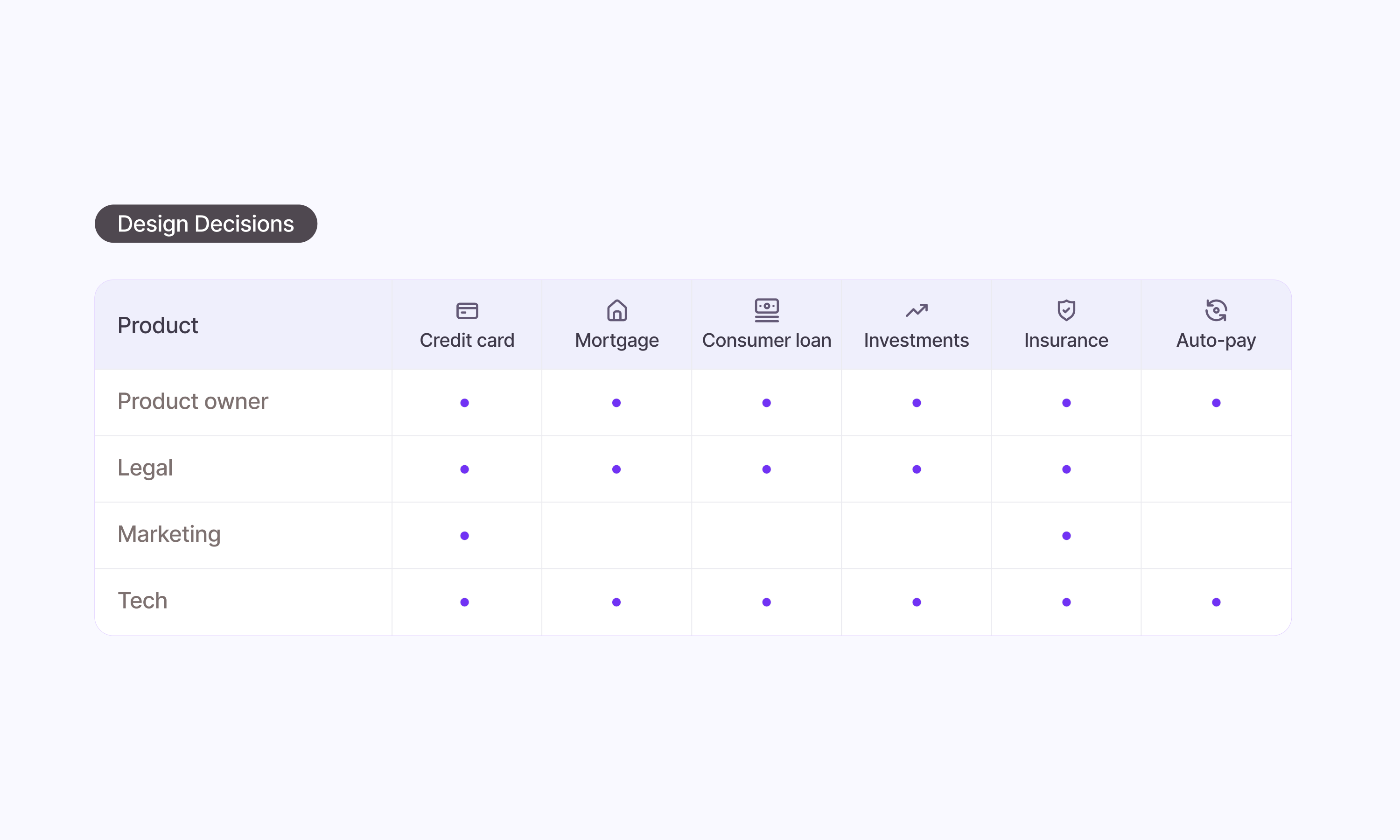
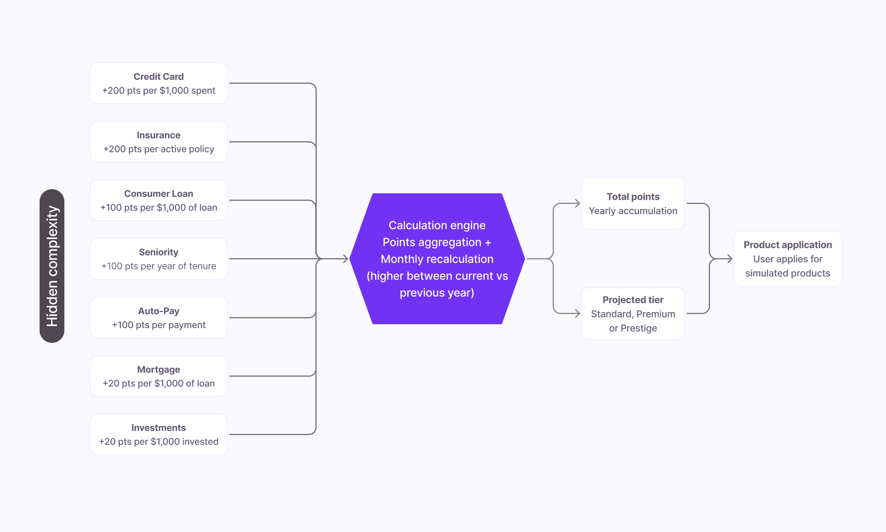
Each product had its own rules: credit card spending, mortgage loans, consumer loans, investments, insurance, and auto-payments. Each one had its own product owner on the bank’s side. I met with all six to map the cases, with the tech team to check what could actually be built at each step, with legal to check every conversion rule and disclaimer, and with marketing to align the language with the program’s promise. We absorbed all of that so users could see a single clean list.
We used AI tools to rapidly prototype different approaches to the simulator’s complexity before committing to a direction.
From tables to answers
The problem wasn’t that users didn’t understand the numbers. It was that the numbers had no context. Seeing “+200 points per $1,000 spent” means nothing if you don’t know how many points you need, how many you already have, or how far you are.
The simulator solved that: instead of a table that required mental math, users entered their real amounts and got a direct answer: with these products, you’ll reach level Prestige by end of year.

Points are not something to spend
In the first round of research, users consistently assumed points were a balance to redeem. The mental model was broken before they even started. The fix was not just copy: we had to make the purpose of points visible at every step. They are progress toward a level, not a currency.
Copy does the heavy lifting
The second round revealed three specific failures, all in the language. A unit abbreviation was misread by 30% of users. A button mid-flow confused 30% because it felt like starting over rather than seeing results. And the investment minimum for earning points was only understood by 30% of users.
Each fix was a single line of copy. Each one moved comprehension from 30% to near-perfect.
Results
In the months after launch, more than a third of all program users engaged with the simulator. Of those, 86% simulated at least one product. Credit card and auto-pay were the most explored, reflecting the most common products in the user base.
Thousands of users run simulations every day and come away with a clearer understanding of the program.

Learnings
Understanding comes from using, not from reading.
The onboarding was never going to do the job on its own. Comprehension came from interacting with the simulator, not from explanatory text. I’d push earlier to make the simulator a primary entry point, not a secondary feature buried in the program section.
The moment after simulation is the shortest and most valuable.
Users who simulate are ready to act. We invested in the path to simulation but underinvested in what happens immediately after. Next time, that post-simulation moment gets the same design rigor as the flow itself.
Evidence beats argument, but only if you have it ready.
The simulator survived because we had data showing 29% comprehension without it. Without that number, the technical complexity argument would have won. Research isn’t just for discovery: it’s the currency that protects design decisions later.